What Makes a High-Performing Business Website in 2026?

A practical framework for building a business website that combines strategy, speed, accessibility, SEO, evidence and measurable conversion.
A business website is often judged by its appearance, but appearance is only the visible layer of a much larger system. A useful website must explain the offer, earn trust, answer practical questions, load quickly, work for every visitor, and turn attention into a measurable next step. When those responsibilities are treated separately, the result may look polished while producing little business value. When they are designed together, the website becomes an operating asset: it filters enquiries, supports sales conversations, reduces repetitive explanations, and gives search engines a reliable picture of the business.
This distinction matters for service businesses, consultants, manufacturers, and growing teams because their visitors rarely arrive with identical knowledge. One person may be comparing providers. Another may have an urgent operational problem. A third may be validating a recommendation. The page must help each visitor understand where they are, what is relevant, and what to do next without forcing them to decode vague marketing language.
Start with the decision the website must support
Before choosing colors or components, define the business decision the website should make easier. For a portfolio like ARG046, the decision is not simply “contact the developer.” A qualified visitor needs to determine whether the developer understands real operational problems, whether the work matches the required level of complexity, and whether starting a conversation is worth the time. This leads to a clearer content sequence: identify the problem, show the type of outcome delivered, demonstrate evidence, explain the working process, and offer a low-friction next step.
A practical way to write this sequence is to collect the questions asked during real sales conversations. Which services are frequently confused? Which objections delay a project? What proof changes a prospect’s confidence? What information is needed before estimating a job? Each repeated question is evidence that the website can remove uncertainty earlier. The strongest pages are not filled with more claims; they contain the right answers in the order a visitor needs them.

Build information architecture around intent
Information architecture is the bridge between business knowledge and visitor behavior. A common mistake is to organize navigation around internal departments or arbitrary page types. A better structure reflects the questions visitors bring. Service pages explain what can be delivered. Project pages provide evidence. About content reduces personal and professional uncertainty. Contact and project-brief pages turn interest into useful input. A blog creates deeper answers for questions that cannot be handled responsibly in a short sales page.
Every important page should have one primary purpose and a limited number of supporting actions. If a service page tries to describe every skill, show every project, tell a complete biography, collect newsletter subscriptions, and request a detailed brief at once, the visitor must work too hard to identify the intended path. Strong architecture makes the next useful step obvious while preserving alternative routes for visitors who need more evidence.
Internal links should be planned as part of that architecture. A project case study can link to the relevant service. A technical article can link to a project that demonstrates the principle. A service page can direct a visitor to a detailed brief only after explaining scope and expectations. These connections help people navigate and also show search engines which pages are central to a topic.
Performance is part of credibility
Visitors do not experience performance as a technical score. They experience it as confidence or friction. A slow hero image, shifting layout, delayed menu, or unresponsive button introduces doubt before the visitor has evaluated the offer. On mobile networks, unnecessary scripts and oversized assets can make a professionally designed page feel unreliable. Performance therefore belongs in the design process, not in a final optimization checklist.
The highest-impact decisions are usually structural: serve correctly sized images, use modern formats, load only the scripts required by the current page, host critical fonts efficiently, avoid large third-party libraries for simple interactions, and reserve space for media before it arrives. Server-rendered HTML is valuable for a portfolio because essential content is immediately available without waiting for a JavaScript application to initialize. Caching and compression then improve repeat visits and transfer efficiency.

Metrics such as Largest Contentful Paint, Interaction to Next Paint, and Cumulative Layout Shift are useful because they describe meaningful parts of the experience. They should be tested on representative devices and network conditions, not only on a developer’s fast machine. The goal is not a perfect laboratory score at any cost. The goal is consistently quick access to the content and actions that matter.
Write proof that can be examined
Generic claims such as “high quality,” “innovative,” or “results-driven” require the visitor to supply their own meaning. Specific evidence is more persuasive. A project page can describe the initial constraint, the decisions made, the delivered system, and the operational improvement. A technical explanation can show why a particular architecture was chosen. Screenshots, process details, and honest limitations demonstrate judgment more effectively than a long list of technologies.
For ARG046, the strongest differentiator is the connection between software and real operations. That should appear through examples: replacing repetitive manual steps, designing around different user roles, preserving data quality, or creating a tool that a team can actually maintain. The visitor should be able to see how technical decisions serve an operational outcome.
Design the conversion path as a useful exchange
A conversion is not merely a button click. It is an exchange in which the visitor decides that the expected value of contacting the business exceeds the effort and uncertainty. The page must therefore establish relevance before asking for commitment. A concise contact form works for visitors with a clear question. A guided project brief works for visitors who need help defining scope. Email, WhatsApp, or LinkedIn may be appropriate alternatives, but presenting too many equal actions at every moment can dilute the main path.

Forms should request only information that will change the next conversation. Name, contact details, project type, context, constraints, and desired outcome are often more useful than a long questionnaire about features. Clear privacy language, visible validation, helpful error messages, and a confirmation page reduce anxiety. Spam protection should operate quietly so legitimate visitors are not forced through unnecessary obstacles.
Microcopy also matters. “Submit” describes the browser action, while “Send project brief” describes the visitor’s outcome. A short note about response time sets expectations. Explaining what happens after submission removes another source of uncertainty. These details are small in code but significant in the decision process.
Accessibility improves the product for everyone
Accessibility is not a separate version of the website. It is a quality standard for the main experience. Semantic headings help screen-reader users and make long content easier for everyone to scan. Visible keyboard focus helps people who do not use a mouse. Sufficient contrast supports visitors in bright environments as well as people with low vision. Descriptive alternative text communicates the purpose of meaningful images when they cannot be seen.
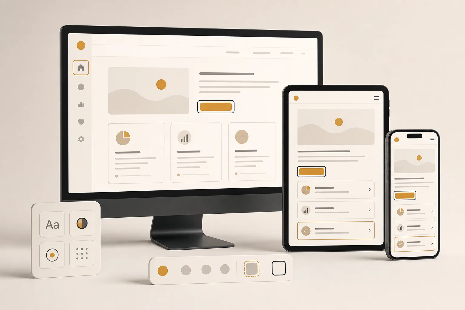
Responsive design and accessibility are closely connected. On a narrow screen, controls need adequate touch targets, content needs readable line lengths, and navigation must remain understandable when rearranged. Zoom should not break the layout. Motion should respect reduced-motion preferences. Arabic content needs a genuine right-to-left layout rather than text placed inside an otherwise left-to-right interface.
Make SEO a consequence of clarity
Search visibility begins with a crawlable, technically reliable site, but rankings are not created by adding keywords mechanically. A page performs when it satisfies a defined search intent better than available alternatives and when the site provides enough evidence for search engines to understand its purpose. Clear titles, useful headings, descriptive links, canonical URLs, structured data, fast delivery, and complete content all reinforce the same meaning.
Service pages should target commercially relevant questions without becoming repetitive location-and-keyword templates. Project pages can capture specific problem and solution language. Articles can address deeper informational searches and then guide readers toward relevant services or examples. This creates a content system in which informational value and commercial relevance support each other.
Measure outcomes, not vanity
A website cannot improve intelligently without measurement. Page views provide context, but they do not reveal whether the right visitors understood the offer. Useful indicators include qualified enquiries, completion rate for project briefs, visits to relevant case studies, search impressions for priority topics, response time, and the proportion of enquiries that match the intended services. Privacy-conscious first-party analytics can answer many operational questions without creating an invasive tracking system.
Measurement should lead to a specific decision. If visitors reach a service page but rarely open supporting projects, the evidence may be poorly positioned. If the brief form is started but not completed, it may request information too early or fail on mobile. If an article earns impressions but few clicks, its title and search snippet may not communicate a distinctive benefit. Each observation should produce a testable improvement rather than an unfocused redesign.

A practical launch standard
Before launch, verify the complete journey. Confirm that every important route returns the correct status, titles and descriptions are unique, forms succeed and fail gracefully, email delivery is reliable, images have dimensions and alternative text, and the custom error page really returns HTTP 404. Test keyboard navigation, mobile layout, language switching, right-to-left presentation, slow connections, and browsers used by the target audience. Validate structured data and inspect the generated sitemap.
After launch, create a short maintenance rhythm: review errors weekly, review enquiries monthly, update dependencies and backups regularly, and revisit priority pages when the business offer changes. A website that remains accurate and operational will outperform a visually impressive site that slowly accumulates broken assumptions.
The durable advantage
A high-performing business website is not defined by a fashionable framework or a dramatic animation. Its advantage comes from alignment. Business goals, visitor intent, content structure, evidence, performance, accessibility, search signals, and measurement all point in the same direction. That alignment makes the site easier to trust, easier to find, and easier to improve.
For a small business or independent professional, this is especially valuable because the website must work without a large marketing team constantly explaining it. It should answer important questions at any hour, present proof consistently, and create better starting conditions for every conversation. That is the standard worth designing for: not simply a site that looks finished, but a system that continues to produce clarity and useful action.